
Apartment kitchens come with limitations most people didn’t choose — dated cabinet colors, basic hardware, lighting that flatters nobody. The good news is that a warm neutral palette works around all of that without touching anything permanent. Soft tones, natural textures, and a few deliberate additions can turn the most forgettable rental kitchen into a room that actually feels like yours.
Warm Neutral Kitchen Ideas
Here are 18 ideas that genuinely work in real apartments, not just in renovated homes with perfect natural light.
1. Build Your Palette Around Warm Sand Tones
Sandy neutrals the tones that sit between beige and golden warm a kitchen up in a way that gray-based neutrals never quite manage. They reflect light softly rather than throwing it back coldly.
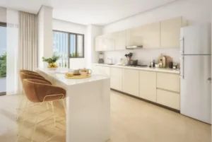
Start with sand-toned cabinet fronts or walls and layer in oatmeal and ivory through textiles and accessories. The tones don’t need to match exactly slight variation between them is what creates depth.
2. Bring in Honey-Toned Wood
There’s a specific warmth that honey-colored wood brings to a kitchen that lighter or darker tones don’t replicate. Oak in its natural finish, bamboo cutting boards, warm-toned wooden shelving these push the palette toward cozy without making it dark.
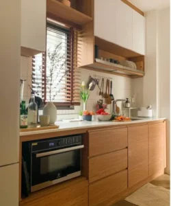
If cabinetry can’t be changed, adding even one wooden element a floating shelf, a wooden tray on the counter shifts the room’s temperature noticeably.
3. Use Floating Shelves as Display Space
A single floating shelf on an otherwise empty kitchen wall does two things simultaneously: it adds storage and it gives you a surface to style deliberately. Unlike a cabinet, what goes on it becomes part of the room’s design.
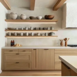
Keep the objects consistent in color cream ceramics, natural wood tones, one small plant — and leave breathing room between them. A crowded floating shelf reads as clutter. A curated one reads as intention.
4. Paint With Undertones in Mind, Not Just Color
Two paints can both be called “warm white” and look completely different on a wall. The undertone is what determines whether a white reads as warm or pulls slightly pink, yellow, or gray in natural light.
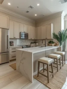
Hold paint samples against your existing cabinets and flooring in the actual kitchen at different times of day before committing. The right warm white should make the room feel softer in the evening, not flatter it under artificial light.
5. Add Rattan Details
Rattan has a specific visual warmth that comes from its natural irregularity no two pieces look identical, and the material catches light in a way that manufactured surfaces don’t. A rattan pendant light above the kitchen table, a rattan tray on the counter, a small rattan basket on a shelf any of these adds organic warmth without introducing color.
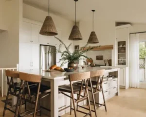
It’s also one of the most affordable texture additions available, which makes it practical for rental kitchens where the budget goes toward removable upgrades.
6. Keep One Countertop Section Completely Clear
In a small apartment kitchen, a deliberately empty stretch of counter communicates calm more effectively than any styling does. It signals that the room is organized rather than stuffed.
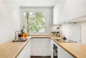
Choose one section ideally near the stove where visual calm matters most during cooking and commit to keeping it clear. What goes on the rest of the counter becomes more intentional by contrast.
7. Layer Two Different Rugs in a Galley Kitchen
Most people put one runner in a galley kitchen and call it done. Two runners in slightly different neutral tones — one near the sink, one near the stove create zones within the kitchen and add more visual warmth than a single piece does.
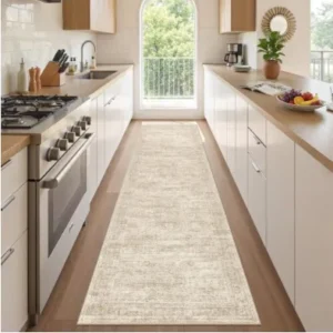
They don’t need to match exactly. Similar tones in different textures or patterns work better than identical pieces repeated.
8. Choose Brushed Gold Hardware Instead of Chrome
Chrome hardware in a warm neutral kitchen creates a disconnect the cool metallic tone pulls against the warmth of the palette. Brushed gold sits in the neutral family in a way chrome doesn’t, and it adds a quiet richness to cabinet fronts without going dramatic.
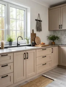
For renters, this is a reversible swap. Keep the original hardware labeled and stored, reinstall before moving out.
9. Display One Category of Ceramics Consistently
Rather than a mix of different decorative objects across open shelves or the counter, choosing one category and displaying it consistently creates a collection rather than an accumulation. All bowls. All pitchers. All small vases. All in the same color family.
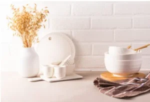 The repetition of one form in slight variations different sizes, slightly different glazes reads as considered in a way that a random mix of different objects never does regardless of how individually attractive each piece is.
10. Install Warm Edison Bulbs in Existing Fixtures
Replacing the bulb rather than the fixture is the lowest-effort lighting upgrade available and one of the most impactful in terms of atmosphere. Standard cool white bulbs in a kitchen produce a flat, slightly harsh light that shows up most obviously in the evenings.
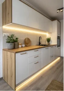
Edison-style warm bulbs at 2200K to 2700K produce a noticeably different quality of light amber rather than flat, warm rather than neutral. The fixture stays, the landlord never knows, the room feels completely different after dark.
11. Try Greige Instead of Straight Beige
Straight beige can pull yellow in certain lights, which pushes a neutral kitchen toward dated rather than timeless. Greige a balanced blend of gray and beige sits more stably across different light conditions and reads as more sophisticated without being colder.
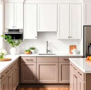
It works especially well in apartments with north-facing windows where warm tones can look muddy. Greige holds its balance in low natural light better than pure beige does.
12. Add a Trailing Plant at Counter Height
A pothos or heartleaf philodendron trailing off the edge of a counter or low shelf brings green into the kitchen at eye level rather than up high where plants often end up. At counter height, the trailing vines become part of the room’s visual composition rather than an afterthought tucked near the ceiling.
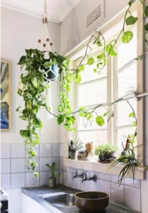
Both varieties handle the lower light and drier air of most kitchens well, and both grow quickly enough that a small plant fills out a space within a few weeks.
13. Use a Textured Linen Roman Shade
A Roman shade in a textured linen or cotton-linen blend over a kitchen window does what sheer curtains don’t — it controls light while adding visual weight and texture to the window. In a warm neutral kitchen where most surfaces are flat and smooth, the gathered fabric of a Roman shade introduces softness overhead.
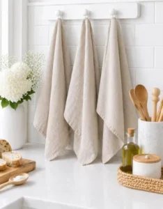
Natural and undyed linen tones suit the palette without introducing a competing color. The shade doesn’t need to be expensive simpler versions in natural fabric read as well as elaborate ones.
14. Cover a Plain Backsplash With Removable Wallpaper
Peel-and-stick wallpaper designed for backsplash use specifically the vinyl-coated varieties rated for kitchens has improved enough that warm stone or subtle tile-effect patterns are genuinely convincing from normal distance.
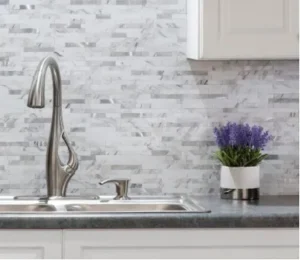
Measure carefully and cut cleanly at the edges for the most finished result. Many of these products come off without adhesive residue if installed on a painted surface that’s in good condition, which makes them a practical option for renters.
15. Style With Antique Market Finds, Not Matching Sets
Kitchens styled with objects from the same collection at the same time have a put-together quality that reads as slightly impersonal. A kitchen where objects arrived gradually a jug from a market here, a set of bowls from a different trip there, a stool found at an estate sale feels inhabited rather than staged.
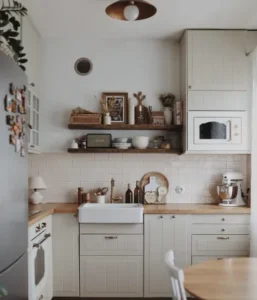
The thrift store and weekend market are the right sources for this. The goal isn’t authentically antique — it’s objects that look like they have some history, which is different from looking new.
16. Place a Small Mirror Near the Window
A small mirror positioned near not opposite a kitchen window catches and redirects natural light deeper into the room. In apartment kitchens where the window is small or at an awkward angle, this adds perceived brightness without any electrical work.
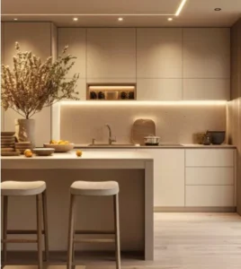
A simple oval or rectangular mirror in a warm-toned frame suits a neutral palette. The frame color matters gold, warm wood, or aged brass all work. Silver or chrome pulls cool against a warm palette.
17. Build a Morning Ritual Corner
A small section of counter dedicated to the morning routine coffee or tea making, a wooden tray, matching mugs in neutral tones, a candle for slow mornings creates a ritual space within the kitchen that makes the room feel more personal.
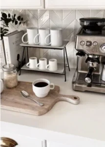
The tray is the detail that makes it a corner rather than appliances grouped together. Everything within the tray’s footprint. The boundary it creates is what gives the station its identity.
18. Edit First, Add Second
The final idea isn’t an object or a material. It’s an approach.
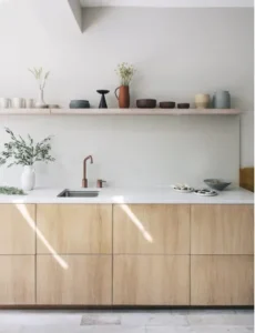
Before buying anything for a kitchen, spend fifteen minutes removing things that ended up there without being chosen the magnet from a trip two years ago, the mismatched container that’s been there since move-in, the appliance that gets used twice a year. Remove them and look at what’s left.
Most warm neutral kitchens that feel cozy aren’t cozy because of what’s in them. They’re cozy because of the quality of thought behind what stayed and what got added. The editing is the design. Everything else just supports it.